
Showing posts with label Viz Dev. Show all posts
Showing posts with label Viz Dev. Show all posts
Tuesday, January 22, 2013
Another one

Saturday, January 19, 2013
Hell train moment


I've sent this to Vince. Let me know ya feedback.
BTW, about the style....I did this straight on PS and I'm not sure if I should add line drawing onto it because everything is far back in the background I can always add pen lines on it later tho.
Wednesday, January 16, 2013


Friday, January 11, 2013
Ben's Office Comps
Hi everyone, I did some B&W comps for Ben's office, I thought since the teachers wanted to see more mood in the work, I wanted to approach the office a bit differently. Let me know which ones you guys think are working. Right now i'm leaning towards the tall one.

Tuesday, December 11, 2012
Hot Wheel!!!

What do you think?

Train revision

I redesign the body part (the central part) of the train to have more curv and make it a little more interesting than just simple straigth line. (Most Kley's drawings are very organic)
And I think it would be nice to show some tranformation or at least show how the train looks like before it will be covered with fire. So the modeler can understand more.
So the idea is the fire emerges/ erupts out from the inside and melt down the train and reveal the soul that were trapped in the train.
I'll try to do some color and upload them later.
Tell me what you guys think.
Sunday, December 9, 2012

Thursday, December 6, 2012
Train design & For presentation


Schoonover--> realistic
Kley--> ink based, very loose
Tenggren--> shape driven, stylised, more whimsical


Stations
Hey folks, here's some stations and water towers, one page is done while looking at Tenggren's layout work for Pinocchio, and the other page is based off of Kley.


Thursday, November 29, 2012


I try to marry the design with "classic haunted house" element.
The first two are very similar. No.3 is more "train station-look" with a tower in the center and extended roof. No.2 and 3 are more caricatured.
Silhouette on the left are the front view of each design.
They will covered with snow after we pick the design.
Sorry I'm still working on the train. Not sure if I can post them by tonight.
Tell me what you guys think?
Update: Sorry my first post was too small, so I post them individually.
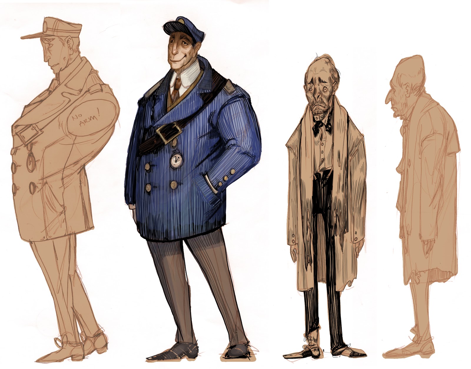
Hey guys! Sorry, I meant to post this yesterday, but here is a list of suggested props.
Stationmaster
Pocket watch
Lantern
Ticket machine
- Example
Charlie
Playing cards
Train Stationy Things
Ticketbooth
Flower cart
Steamer trunks
Benches
Signage
- Directional (ex. heading towards San Jose etc)
- Exit Sign
- Signs for the stationmasters office
- Ticketbooth sign
Newspaper/Novelty stand
And anything else we think of :D!
Wednesday, November 28, 2012


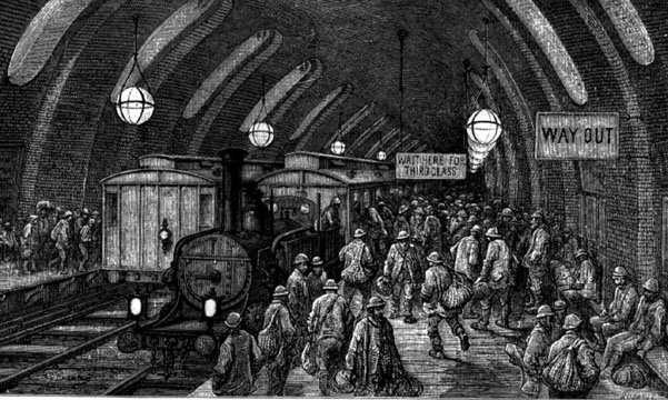
Train Station thumbnails/Studies


.jpg)

Tuesday, November 27, 2012
Vis Dev-examples
Hey all! Here are some hand-picked examples from our beloved Madam Bradfield as to what she'll be looking for in future vis dev work.
Some notes on the artists:
For Searle, pay close attention to his use of contrast between blank/simple spaces vs the busier areas (how it guides the eye) and how he uses just a few lines to suggest/extend form rather than describe every detail.
For Kley, look at how he uses his line work to wrap around forms and build up geometry, and how the lines all follow the perspective planes. Also, look at how his creates his values.


Progress Update
Hey everybody, so far I've got a handful of silhouette comps for the train station; just playing with shapes. I want to go over them with line art next to try to capture the feel of the artists we choose. Also I've got a line drawing for a style test that I can post up in a little bit, right now its too scribbly to understand.
.


Subscribe to:
Posts (Atom)